Designer - Web | Graphics | UX/UI

Dorothy DeLong
Logo Redesign

Who is Dorothy DeLong?
Dorothy DeLong is a feminist photographer who travels the country snapping pics of women doing amazing things. Whether it’s protesting for pay equity, fighting for environmental regulation, or standing up for those in the #MeToo movement, Dorothy covers it all.
Problem
After her website's responsive redesign (visit that case study here) - Dorothy LOVED it! However, she felt that her logo was lacking and looked outdated with the new look. She still liked the general idea of the logo, but wanted it to look more polished.
How might we ensure that Dorothy's logo reflects her brand identity?
Solution
This project focused on client research to fully understand Dorothy's brand, so I could design a refreshed logo that reflects Dorothy's brand identity.
Project Scope
-
Timeline: 1 week
-
Key takeaways and project recommendations, based on client research
-
Logo Design and Brand Identity Style Guide, with all necessary file types (SVG, EPS, PDF, PNG, JPEG, PSD)
My Role
-
UI design
-
Client research
-
Client contact
Tools
-
Adobe Photoshop
-
Adobe Illustrator
-
Google Forms
Design Thinking Process
A happy client makes a repeat client!
Since I have worked with this client previously, the design-thinking process I used focused on digging deeper into the empathise stage to understand the nuances of her vision and brand identity fully. This knowledge influenced the decisions throughout the rest of the process to ensure a seamless logo redesign.
Click the numbers below to jump to different steps in the process!
Empathize
Meet the Client, Be the Client.
How can we ensure that Dorothy's logo reflects her brand identity?
Quantitative Data - Client Questionnaire
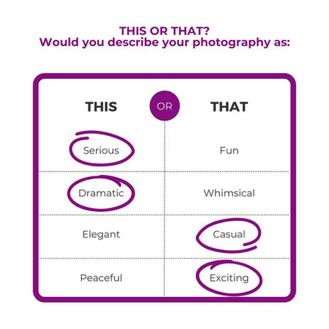
After finishing Dorothy's website redesign, I felt like I knew her and her work fairly well. But to gain an even better understanding of Dorothy and her brand, I had her complete a brief questionnaire that I created in Google Forms.
The following images recap the adjectives she used to describe her photography.

Define
What are the key takeaways about the client and her goals?

Color Palette & Fonts
Dorothy still loves her brand colors and fonts (and I agree!) - they both capture that her brand is BOLD & FEMININE - so those will remain the same.
Logo
Dorothy said she wasn’t tied to the original logo - a combination of the female symbol and the aperture. She’s not feeling it, but can’t exactly put her finger on ‘why’.
I think it’s clever and a great combination of what her brand stands for. But, I do want to make some changes to it:

Dorothy's original logo
The thin line used for the graphic is too delicate. I need to use something bolder (literally and figuratively) to echo Dorothy's brand voice.
The line’s rounded ends make it feel juvenile (almost like it was drawn with a crayon). I want to add some hardness to it by using thicker lines and sharp corners, where applicable.
Ideate
Get the creative and
problem-solving juices flowing.
Logo Brainstorming & Iteration
The following is an iteration exercise I did to help develop the new logo:

Present
Bring it to life!
Brand Style Guide
Once I settled on the new logo design, I created a Brand Style Guide that featured the logo, along with her existing brand elements.
I presented this via Zoom to Dorothy for her final review and approval.
Reminder
This project sprung from a website redesign project for the client.
If you'd like to check out that case study, click the button below.
_edited.png)
Lessons Learned
Takeaways
This project was so fun to be a part of! The unexpected add-on of redesigning Dorothy’s logo (after initially being hired to design a responsive website) was a pleasant surprise and not only showcased her confidence in my design capabilities but also affirmed the trust and rapport cultivated throughout our collaboration.
Dorothy's subsequent request highlighted the value of cohesive brand identity and the necessity of adaptability in design. By collaborating closely with her, I ensured the new logo was bold and strong, perfectly complementing the revamped website.


